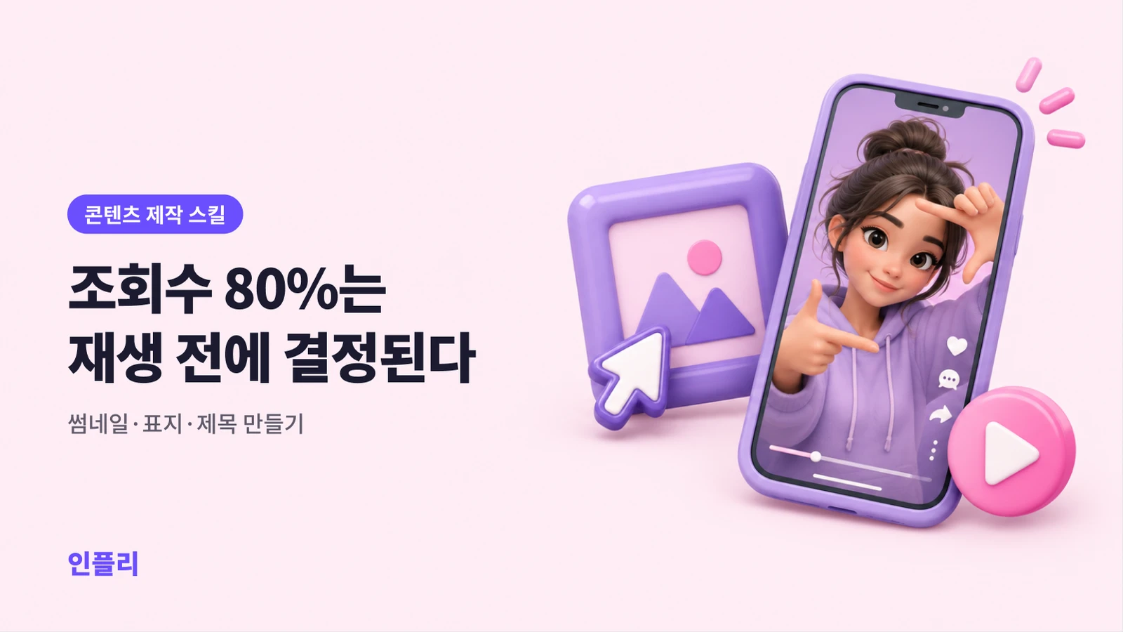
80% of your views are decided before anyone presses play — thumbnails, covers and titles that get the click
inflee team
8/29/2026
The video you stayed up all night making might never be watched. Not because it's bad — because nobody clicked.
Let's be blunt: however good a video is, if no one presses play, it might as well not exist. And whether someone clicks is decided before playback by two things: the thumbnail (cover) and the title. That's why thumbnail and title CTR matter so much.
Short-form is no different. In the Explore feed, recommendations and your profile grid, your video competes with one cover image and one line of text. This guide covers the principles and formulas behind thumbnails and titles that raise your click-through rate (CTR).
Why click-through rate matters so much
CTR is the percentage of people who saw your post and tapped it. Why is it the key to views?
Platforms first show a new post to a small group. If CTR and completion are good, it's shown to more people; if those people respond well, it spreads again. If early CTR is low, the spread never starts.
If completion rate is the power to keep people who walked in, CTR is the power to make them open the door. You need both to take off.
It's common for the same video to get several times more views just by changing the thumbnail. That's how much one cover can do.
The psychology of covers — grab them in half a second
Viewers look at each cover for about half a second while scrolling. In that moment, you need to create "what's this? I'm curious".
Rule 1. Faces and expressions — emotion gets clicks
- Faces, especially visible emotions, pull the eye hard: surprise, shock, joy, doubt.
- An exaggerated expression usually beats a neutral one (as long as it fits the context).
- Eyes toward the camera feel like you're talking to the viewer.
Rule 2. Text: big and short
- Keep cover text to three to five words — it has to be read in half a second.
- Make it large enough to read on a small screen. Nobody reads long sentences.
- Use white text with a black outline (or the reverse) for strong contrast.
- Highlight one or two key words in a different colour.
Rule 3. Contrast and simplicity
- A cover can't be busy: one message at a glance.
- Strong contrast in colour and brightness between subject and background.
- Three elements at most — say, a face, text and one highlighted object.
Rule 4. Composition — design where the eye goes
- Person on one side, text on the other, for balance.
- Arrows, circles and highlights say "look here".
- Don't fear empty space. Fill every corner and nothing gets read.
Rule 5. Create a curiosity gap
The core driver of a click is curiosity. Don't give the whole answer on the cover — show half.
- Weak: "Fried rice recipe" — the answer is right there. No reason to click.
- Strong: "Add this and your fried rice tastes completely different" — add what? Click.
Formulas for titles and first lines
In short-form, the "title" is the first line of text shown above or below the video — usually the first line of your caption. It feeds straight into CTR. Formulas that work again and again:
1. Number + result
- "How I gained 1,000 followers in three days"
- "A café-style dessert made for the price of a coffee"
- Numbers feel specific and credible.
2. Information gap
- "The editing trick nobody tells you about"
- "I wasted three years not knowing this"
3. The contrarian angle
- "Don't buy a camera"
- "How I lost weight without working out"
- Claims that go against common sense stop the scroll.
4. Call out the audience
- "Only watch this if you're starting short-form"
- "If you're thinking about a side hustle"
- When viewers think "that's me", they tap.
5. Loss aversion and warnings
- "Skip this and your views won't grow"
- People hate losing more than they like gaining.
What to avoid in titles
- Clickbait — a cover or title that doesn't match the content. Early drop-off explodes and trust collapses. Create curiosity, but never lie.
- Long or vague lines. Put the point in the first few words.
- Jargon and inside jokes. A first-time viewer has to understand it.
Making thumbnails — free tools are enough
- A free design app with templates: plenty of short-form cover layouts, good for beginners.
- Your phone's video editor: choose the cover frame and add text on top.
- A consistent style: repeat the same font, colours and layout, and your channel becomes a brand people recognise in the feed.
For covers, grab a frame where your expression is great during filming, or shoot a few cover-only shots. Pulling a random frame from the middle of a video often catches an awkward face.
If you post on a schedule, set your cover and first line when you queue the post — a free Instagram scheduler lets you prepare both calmly instead of rushing at posting time.
A/B testing — data, not gut feeling
"I think this one's better" is often wrong. Test it.
What to test
| Variable | Example test |
|---|---|
| Cover expression | Surprised vs. smiling |
| Text | "This is huge" vs. "Did you know this?" |
| Text or no text | With text vs. a clean image only |
| Colour | Red highlight vs. yellow highlight |
| Title formula | Number-based vs. curiosity-based |
How to test
- If your platform has a built-in thumbnail test, use it (some platforms offer one).
- If not, apply different styles to two videos on similar topics and compare CTR.
- Change only one variable at a time. Change several and you won't know what worked.
- Collect data for at least several days to a week. Don't decide on one day's numbers.
How to read the results
- Low CTR → a cover and title problem. People aren't tapping.
- High CTR but low completion → clickbait, or the content doesn't live up to the cover.
- Both good → ready to spread. Repeat that style.
Once people click, the rest of the numbers tell you whether the post delivered — see how to read Instagram Reels insights for the order to read them in.
Pre-posting CTR checklist
- Is the cover readable at a glance on a small screen?
- Is the text five words or fewer?
- Is there an eye-catching element such as a face or expression?
- Is there enough contrast between subject and background?
- Did you leave some curiosity (not give away the whole answer)?
- Is the point in the first few words of the title?
- Do the cover and title match the actual content (no clickbait)?
- Is it consistent with your channel's style?
- Is the text clear of the platform's on-screen buttons?
- Have you decided what to A/B test next?
Spend time on what happens before play
Many creators spend ten hours on a video and five minutes on the cover and title. That's backwards. Even a great video gets zero views without a click. Spend at least 10% of your production time on the cover and title — those minutes can multiply your views.
Content that earns clicks is attractive to brands too. Keep improving your covers and titles, and make the rest of your workflow lighter with free creator tools — a link page, auto DMs, scheduling and insights in one place.
inflee team
inflee marketing
Everything about influencer marketing, from inflee.